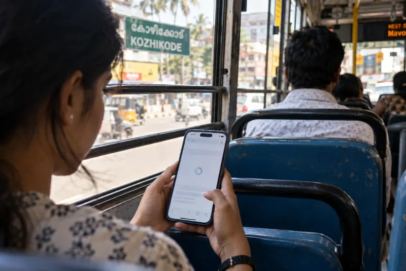
Your website looks stunning on your laptop. Big images, smooth animations, a hero video that fades in beautifully. Then someone opens it on their phone while riding a bus through Kozhikode, and it just sits there loading. That gap between how a site feels on fast wifi and how it behaves on real mobile data is exactly why mobile friendly websites matter more than most people realize in Kerala.
Let’s talk about what mobile data speeds actually mean for the design choices you make, not just how fast a page loads.
Why Speed Isn't Just About Load Time?
Most people think mobile optimization stops at “making it load fast”. That’s only half the story. Real network conditions change how people experience every part of your site. A slow or patchy connection affects your images, your fonts, your scripts, and even whether a button responds when someone taps it.
Kerala has strong mobile penetration, but speeds vary a lot depending on where someone is standing. A user in a city center gets a very different experience than someone in a hilly area with one bar of signal. Web designing for the average phone means designing for that variation, not for your office wifi.
Heavy Design Choices Punish Slow Connections
Every design decision has a weight. That autoplay video, the giant background image, and the custom font loading five styles you don’t use. On a fast connection, nobody notices. On mobile data, each one adds seconds and eats into someone’s data pack.
Lighter design isn’t about making things ugly. It’s about choosing what earns its place. Compressed images, fewer scripts, and a layout that loads the important stuff first all keep the experience smooth. Google has long pointed to page speed as a factor in how mobile pages perform and rank.
Layout Decisions Change on Small Screens
A design that works on a wide screen often falls apart on a narrow one. Menus get cramped. Text runs too small to read. Buttons sit too close together for a thumb.
Responsive web development fixes this by reshaping the layout for the device. Content stacks cleanly, tap targets stay comfortable, and nothing forces users to pinch and zoom. This is where good web development shows its value, building sites that adapt rather than just shrink. Silverhost’s work in web development services across Kerala centers on this kind of practical, device-aware building.
Fonts, Images, and the Little Things for Mobile Friendly Websites
The small stuff adds up. Fonts that load late cause text to jump around. Images without proper sizing shift the whole page as they appear. On a slow connection, these glitches feel worse because they last longer.
A stable page feels trustworthy. A jumpy one makes people leave before they even read anything.
Designing for the Thumb, Not the Mouse
On mobile, people navigate with one thumb, often on the move. That changes everything about where you place things. Key actions belong within easy reach. Long forms feel painful. Tiny links get missed.
When you design around how people actually hold and use their phones, your site stops fighting them. That’s the heart of what makes mobile friendly websites work, matching real behavior instead of forcing desktop habits onto a small screen.
Final Thoughts
Mobile data in Kerala isn’t uniform, and your design shouldn’t assume it is. Every image, font, and layout choice either respects a slow connection or punishes it. The sites that win aren’t the flashiest ones; they’re the ones that stay fast, stable, and easy to tap wherever someone opens them.
So take an honest look at your own site on a phone with mobile data, not wifi. Does it feel effortless, or does it make you wait? Which one do you think your visitors are experiencing right now?
FAQ
It loads fast on mobile data, fits the screen without zooming, and has buttons big enough to tap with a thumb. If people can use it comfortably one-handed on a phone, you’re most of the way there.
Yes, more than people expect. On mobile data, a few oversized images can add real waiting time and burn through someone’s data. Compressing them is one of the easiest wins you’ll find.
Close, but not identical. Responsive design reshapes your layout for each screen. Mobile friendliness is the bigger goal, which includes responsiveness plus speed, tap targets, and stability.
Usually fonts or images are loaded without set sizes. The page rearranges as things pop in. Giving images fixed dimensions and trimming font styles keeps it steady.
It plays a part. Search engines factor in mobile experience and speed. A slow, clunky mobile site tends to lose out to lighter, smoother ones.